Monday 29 April 2013

Exam Evaluation


Exam Evaluation

In total completing my collage took me a full 8 hours. In order to create this effect I first had to edit all the photos on photoshop, giving each photograph a little touch up, adjusting the curves, brightness and contrast, hue and saturation, photo filter, colour vibrancy and more. I then printed each one off and measured 1/2 cm strips before proceeding to cut them out and stick them together. I had come across several limitations and several dilemmas during this exam which prevented me from accomplishing what it was I originally wanted in this exam.


The first problem I had come across was the whereabouts of my negatives. Without this I was not able to produce the film photographs that I wanted. And because of this I had to adjust some of my photographs and turn them into black and white. So although keeping as much as I could to my original idea, nothing could change the fact that I could not produce any film shots.


The screen shots pasted throughout the blog post show the progress I went through on photoshop in order to change them to black and white. I screen shot all the pictures whilst keeping th history showing, to show what changes I made to each photo.

Another dilemma that arose during the exam was timing. I underestimated how long cutting and pasting each photo onto a piece of mounting card. My original idea was to produce 6 outcomes all together, however due to the fact I hadn't experimented with my idea before hand, producing my outcome took longer than I had first anticipated.

Problem number 3: undeveloped film. I had taken film shots of construction sites along with digital. However due to time and poor development my film came out undeveloped and in the end was unused.
All these photos I used in these exams and these are the final outcomes before they were cut into strips and stuck together. My main inspiration was Lewis Hartfull, who had influenced me to create a collage, although I wasnt particularly fond of collage I found that in all my photos as they were on their own didnt reflect the covert and obscured theme, and that I would have to take drastic measures in order to have my photos reflect the theme properly.

I had also chosen in the end to do collage as I had always shied away from this method, I didn't particularly like producing collages, however when looking at his work it influenced me enough to try and recreate his idea with my own photos and my own twist and take to this.
In all, although coming across many obstacles throughout this exam, finding it quite tricky to create the collage and mount the work, I enjoyed the prep work and was quite pleased with my final outcome. Although producing only half of what my intended goal was, I believe I still have a strong outcome, which to my pleasure is what I wanted.


Final Idea before the exam


For the final exam I have decided I to juxtapose 6 different photos together, cutting them into fine strips and then merging them together in the exact same order. To showcase all the skills I have learnt the past year I had decided to produce two coloured photo, from both photoshoots, digital photographs only, two film photographs, black and white using all the dark room techniques I had gained, and then merging two black and white film photographs along with two digital photographs in order to complete this juxtaposition, whilst keeping to the exam theme. I hope that I will be able to complete all the chosen photographs along with all my ideas in order to really achieve what it is I wan from this exam.

Development


MY CONTACT SHEET


When originally looking at my idea I had realised that not much development had gone into my idea. My main idea was to weave two different nature pictures together in order to obscure the photograph , and this was the idea I had stuck with. With a lot of deliberation I decided to take the idea further, with this in mine I had chosen to juxtapose my photographs. Bringing together two complete opposites into the one picture. With this in mind I set out to take another photoshoot. Looking at man made architecture, construction sites, derelict buildings and grave yards. The contact sheet above shows the photos I took and the photos encirlced with red pen are those I had chosen to possibly look at and develop further. With this I was going to take photos from this shoot, along with photos from my original shoot, and collage(merge) the two photos together. 

Edits


Edits.

These are a few more edits I had done while experimenting on Photoshop, using tutorials that had been posted on on the lesson blogs as a guide. Although difficult to achieve, I was able to create an effect that I had never produced before, and in turn creating an effect different to what I was used to. These all add to my experimentations. Although I would probably not take this method any further when it comes to my exam, it was an idea I wanted to explore.


Tuesday 16 April 2013

Exam Review


Exam Review


Originally when starting this exam theme I didn't know exactly what direction I wanted to take. Although having acknowledged several pathways in which I could develop in ways that suited me, I couldn't decide which one I wanted to do. and thats where the problem arose. In taking to Pintrest, I managed to find something that interested me. Looking at other work photographers had produced via Behance I found something that interested me. 'Hidden Places' By Barbra Maria Silva and 'Camouflage' by Lewis Hatfull
Looking at these two photographers inspired me to take the photos I did. I managed to find a hidden place that was a lot closer to me than first anticipated. Because of this, I managed to maintain my usual style but convert it into a way that suited the exam theme. When it comes to experimentation I have managed to experiment with filters and colour vibrancy to change enhance the photos. I have made handmade negatives with the use of acetate, salt and vaseline which turned out to be extremely successful, as it gave my work this natural and earthy feel that corresponded with my style quite well. Additionally I plan to for my exam experiment with weaving and collage to make this outcome extremely successful. Luckily for me I didn't come across any limitations, having my work quite expressive and quite natural, I only have to look at what surroundings and use them to my advantage.

Other than searching for the perfect location and the right weather conditions there wasn't that many limitations.
My ideas are not set in stone. Although I have decided that I'm going to use weaving and collage to obscure my photographs, the choice on whether to use only my digital photographs, only film photographs, or combine the two has been left decided. Depending on the amount of time I have I may do all three.


Monday 8 April 2013

Other Digital Edits


Other Experiments


I did a few other edits in photoshop with a few experiment shots that I took earlier on today, taking advantage of the lighting that I was given.

ORIGINAL


EDITED


Brightness: 53;
Contrast:100;
Curves; 
Channel Mixer: Red: +109; Blue: -5;  
Colour Balance: Cyan:-66, Magenta:-35, Blue:+3, 
Luminosity preserved; 
Hue and Saturation: Saturation:+18 
and the use of the Blur Tool.


ORIGINAL


EDITED

Curves;
Vibrancy: +64, Saturation: +43
Brightness: 117;
Contrast: 63;
Blur Tool; 
Brightness: 69;
Contrast: 100;
Colour Balance: Cyan: -83 Magenta: -20 Yellow: -3

ORIGINAL


EDITED


Curves;
Brightness: 55;
Contrast: 61;
Colour Balance: Cyan: -71, Magenta: -33, Blue: +17
Channel Mixer: Red: +100
Hue and Saturation: Saturation: +31

Digital Edits


Edited Digital Photographs.

Experiments

 I also decided to experiment with the digital shots I had taken aswell, all in order to find the perfect settings for each photograph, so when the exam came I would be able to know what to do with them. So in the next series of photos you will see before and after photographs, along with an account of what I did to them
The one below had a lot of editing in order to create this effect. I used the curves tool, photo filter, vibrance, channel mixer, hue and saturation, along with a change in the brightness and contrast. For the photograph to now look like this the photo filter was placed on 'warming filter, with a density percentage of 25%', the vibrancy was changed to +16 along with the saturation which was changed to +39, when using the channel mixer; the red was placed at +100 and the green was placed at +10. I didn't change the hue; but the saturation was changed to +13; the brightness and contrast was also changed. The brightness was moved to -43 and the contrast was placed at 45.

EDITED

ORIGINAL


 ORIGINAL


 EDITED


 With this one I changed several things like the one above. I used the curves tool (as always), I also modified the brightness and the contrast: brightness: 57; contrast: 88; along with the vibrancy; +50 and the saturation +5


 ORIGINAL


EDITED


Curves used, Brightness: 38; Contrast: 25; Vibrancy +29; Saturation: +33


ORIGINAL


EDITED


Curves used;
Brightness: 19;
Contrast: 41;
Channel Mixer: Red: +100, Blue: -8;
Hue and Saturation: Hue; -5, Saturation: +21.


ORIGINAL


EDITED


 Curves;
Brightness: 58;
Contrast: 3;
Channel Mixer: Red: +100, Blue: +25;
Colour Balance: Red: +73, Green: +56, Blue: +63


ORIGINAL


 EDITED


Curves used;
Brightness: 38;
Contrast: 40;
Channel Mixer: Red: +100;
Hue and Saturation: Hue: -2, Saturation: +7, Lightness: +19


ORIGINAL


EDITED


Curves Used;
Channel Mixer: Red: +100, Green: -8, Blue: -7;
Brightness: 62;
Contrast: 21;
Vibrancy: +45
Saturation: +11
Colour Balance: Cyan: -35, Magenta: -39, Blue: +37

Film Shots


Edited Shots

Slight touching up with photoshop

This is one of the various photos I shot on a film camera, these photos were taken on a little walk way near to my college. Although not entirely obscured, this was a starting point. Focusing my attention on hidden places I could obscure this photo in any way I desired. However in order to get to that stage I needed to enhance these photos first. So I took to photoshop to adjust the contrast and add more tonal value, I then used the colour balance and added a little 'Cyan' to the picture.


Again, I used the curves tool along with the colour balance tool as well (cyan) in order to create this effect. I was previously told to try the dodging and burning this photograph in order to keep the haziness that appeared on the right, and the darkness and contrast of the trees on the left.But when experimenting the the curves tool a little more I ended up with this outcome.


With most, if not all of the photos I took, they needed to be adjusted in terms of contrast, so I used the curves tool to adjust each one.


This one, on the other hand, was a different story. This was a handmade negative I had created using acetate, vaseline and salt, after sandwiching the acetate into the negative holder, I developed this on the photographic paper and this was the outcome. I used the clone stamp to patch up a few areas that went undeveloped, and in all managed to create this. I enjoyed making handmade negatives, and although I don't exactly have any plans to take it further, it was a lovely experiment.

Sunday 7 April 2013

Man Ray Analysis


Man Ray Exhibition

Man Ray, (born as Emmanuel Radnitzky August 27, 1890 - November 18, 1976) an american contemporary photographer, who although deceased, his work is still seen today and considered an inspiration for many photographers. Not only for his work but for the contribution to the Dada and Surrealism movements.
His fields ranged from painting, to working in the media, to even fashion photography. He's renowned for his avant-garde photography along with his fashion, portraiture and photograms.

To my pleasure I was able to witness his work first hand in the exhibition that was held at The National Portrait Gallery.  Upon entering, I realised that all of his work was quite small and quite delicate. It was really intimate and miniscule, it made you take time and admire his work carefully. Whereas in the Juergen Teller exhibition, each photo seemed to jump out and at surround you, consequently bringing you into Tellers world and seeing things through his eyes in an abrupt and punchy way, using large scale to his advantage that is, Man Ray took the more subtle approach, his miniscule scale and zero use of colour made the audience, including myself, appreciate his work. His work wasn't overwhelming, or overpowering, you wasn't thrown or engulfed forcefully into his work, instead quite the opposite.

When studying and observing Man Ray's work closely, it was obvious that a lot of careful planing and care went into his work, and a lot of factors were considered, positioning of the subject, lighting; whether it be key lighting or front lighting etc, and the different emotions he wanted his models to portray.


In all of his photographs there always is a high level of contrasting tones, along with different emotions that can evoke different interpretations and assumptions from the viewer/audience. An example of this is the picture above, whereas my personal reaction and the emotions I drew from this photo were sadness, loneliness and self consciousness, whereas others may assume it to be just positioning or simply boredom. I came to notice that Man Ray's main focus for work was the features of the face and the structure of the human body,its elegance. With the use of such methods as solarisation like the photo on the left give emphasis to her features while sitting profile. I find Man Rays work to always contain a certain of elegance, his work always seemed to be quite refined. There was no massive amount of theatrics, dramatization, there were quite simplistic and seemed quite natural. 

Tuesday 26 March 2013


Covert & Obscured Exam Theme.

My personal intake on the exam theme. 


To begin I didn't know exactly where I wanted to begin with this theme. I knew that I could take various directions when it came to this exam theme that best suited my style. Although I've been proven to take decent portrait photos, this wouldn't be the direction for me to take, as it wasn't a consistent strong point of mine. The best pathway for me to take would be landscaping and architecture, city life and everyday life. If this being the case it had opened various options and various opportunities to exploit. 
Relating the exam theme to locations I would need to look at the following:

Forests( Foggy and or Misty)
Oxford Street and Busy Areas (Street Life)
Tourist Attractions (Street Life)
Caves and Hidden Passageways
Holes
Junk Yards
Abandoned and derelict buildings
Abandoned building works
Old, Burnt down buildings/ Houses.
Alleyways
EveryDay Travel

All of these ideas linked to both my preference and to the exam theme. It would be possible to have a subject in this photo and hide their true identity to develop some of these ideas further. Nonetheless these locations made for a good, and rather interesting starting point.
To obscure the idea even further it would be a choice to take each photographs from different points of view. For example I could take all my photographs at a birds eye view. A view that many don't get to see.

With all this being said I was hoping to find a photographer who would inspire me. One that shared the same interest in landscaping as I did, but fit into the Covert and Obscured exam theme as well as I did.


Rankin and his 'destroy' project


John Rankin Waddell (Rankin) born in 1966, a british contemporary photographer, whose unique take to fashion and portrait photography, inspires many upcoming photographers to take their photos to new levels, new meaning and a new approach not seen by many.
The 'Destroy' project commenced in dedication to the Youth Music's 10th birthday. In lute of the celebration 70 of the worlds renowned musicians and visual artists were collected together to have photographs taken by Rankin which were then donated to Youth Music. In addition to this, the photographs that were taken of each individual participant had their chosen photograph sent to them, which they then had to personalize or 'destroy' in anyway they wanted and suited them. These participating artists included; Joe Strummer, Ian Brown, Andre 3000, Kylie Minogue, Robyn and such bands as Pete and the Pirates, The Enemy and The View.

This project allowed each individual to express themselves in anyway possible. Just as a photographer expresses his/herself with each photoshoot they do, be it landscape or portraiture, it allowed the photographs to have more meaning and be given a new light different from what the art world had seen before.


Rankin had said that the photos were basically a way for each celebrity to comment on what they thought compared to what the media thought or had scrutinised them for. He commented by saying that the photographs that we had seen in the magazine were nothing but glossy lies. With this being said, letting the participant have some influence and impact on the message of the work, bringing their own individuality to the work. Which brought a new intake to the world of photography.

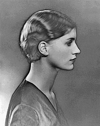
It was interesting to see the creativity of each celebrity, and what message, if they had one, they wanted to portray. For example the picture on the left is the altered version of Kylie Minogue photograph that Rankin took. In order to alter it she used nail varnish, which she focused around her breats which looks as if being scratched out. This represents her battle with breast cancer and how in turn affected her and how she overcame it. Whereas others simply altered their photos to match their personality or what they see.

Looking at the aesthetics, each photo varied. Some were black and white, like this one on the left, obviously with amazing contrasting tones and tonal value and a well thought about composition. Other photos were taken in colour, with the use of front lighting and key lighting to create different shadows on the body and bone structure, and different colour backgrounds In all this Project would have to be my favourite of all time. The way each artist was able to express themselves naturally and however they wanted, with whatever medium they chose. Ranging from oil paints, thread, red markers and nail varnish is really inspiring, it gave his work more emotion, more intimacy and a new meaning.

Friday 22 March 2013

Initial Digital Photographs.


Digital Photographs.

All these photos were taken over a period of time. these are several different photoshoots and random photo taking all around london. I took these photos with my Fujifilm HS30 EXR Camera. I used various settings in order to take these photographs. For the night time scenery photographs I used manual (m) To adjust the aperture and shutter speed myself, Along with the EXR setting.
For the dying flowers I used the landscape setting (SP2) and I also used the Adv. setting. These same settings applied when taking the landscape forest photographs, in addition to using the SP1 setting (portrait and skin tone setting). Although I won't be using all these photos, I wanted to have a variety to work from.