Wednesday, 19 December 2012

David Bailey Analysis


David Bailey.


David Bailey, born 2nd January 1938, a contemporary british fashion photographer, who worked with such magazines as British Vogue in 1960, and even helping to create the 'swinging london' in the 1960's is considered to be one of the greatest british photographers. 

From the two photos above we can detain that there are a lot of black and white contrasting tones, with little or no use of digital retouching or digital animation, and although without the presence of props, his work is very theatrical and could be considered as symbolic. With the use of lighting and emotions he is able to evoke different emotions from the viewers which makes his work very eye-catching.
Using the two pictures above as an example I believe that the emotions being portrayed above are completely controlled and are trying to send out a message, using front lighting to his advantage. For example, In the Jack Nichlson photo I believe he deliberately requested that he shouted and screamed in the picture, this, to symbolise the type of hell raising, troublesome characters that Jack Nichlson usually plays. However I also believe he deliberately placed the light to the side of his face (front lighting) to symbolise that this is only one side of Jack Nichlson, the characters he's usually asked to play. The light represents that this is only a part of who he is and not an overall summary. 
I think he also used this method for the Will Smith photo above, a person who i personally remember playing a goofy character in a programme 'the fresh prince of bel air' back in the 90's. Bailey also used this to his advantage to show that this once goofy character, as we can see from the pose that has been chosen, is only a part of who he is and not an overall summary, juxtaposing his work.

I feel as if the photographs that Bailey takes are filled with such emotion, as though he puts a piece of himself in every photo, in every frame. Considering the fact that everything about these photos are under his control, from the brightness of the light, positioning of the light, facial expressions, body language, so on and so forth and the way he manipulates certain aspects make his work memorable and very recognisable. 


Andre Kertesz


Andre Kertesz


Andre Kertesz ( born 2nd July 1894 and died 1985) a hungarian photographer who's work, although extremely underrated in the early years of work, after a strong 70 years of photojournalism, he is now considered as one of the seminal figures of photojournalism for the interesting and creative work he has produced.

Its very apparent that in Andre Kertesz work, the range in tonal value is wide, contrasting from jet blacks  from the lightest shades of greys and white. He takes the un-ordinary of everyday life and manipulates it to his advantage, creating eye-catching photography.

His photos are very simplistic and although having stopped his work years before he died, his photos are classified to be quite modern and/or even contemporary.
Andre's work has a very serene feel to them, the simplistic theme he has applied to all his photos add to this theme. None of his photos seem to have any hint of drama or theatrics, I don't think he used any digital animation or enhancement either, just the use of a filter in the developing machine.


It's clear he thought about the composition of each piece, where the objects would be placed, the shadows that would be casted,where and how dark each shadow would be, so there is a low level of spontaneity in his work, so his work has a high level of control and thought.


In all Andre has managed to create very interesting photographs through his use of control and creativity. His use of tones in his captivating pieces add to the piece, I feel that his work wouldn't have the same impact if he had chosen to use colour in his composition.I personally;like his work overall,the simplistic and surreal feel to his work enticing.

Tuesday, 4 December 2012

Final Outcome evaluation


Evaluation on final outcome


Everyday life. The theme that was given to us to exploit and manipulate in anyway possible to make it as personal as we chose. In my case I decided to make is as natural as possible. Nothing staged, not digital enhancing or use of lighting. I decided to manipulate the lighting and everything that is naturally around me in everyday life effectively. My initial idea was to capture as much emotion as possible from the people that are usually around me and record each photo as if they were to be put into a diary for safe keeping. The reason I chose to represent my photos like this was not only because it was personal to me, and that I prefer to capture each moment as they come, but I felt that this would represent "everyday life" to the fullest.

However, to get to the final outcome was a struggle, I had produced two undeveloped negatives that couldn't be used, and even then the third set of negatives had been exposed to light slightly, causing lines over some of the pictures. This meant that I could only select certain photos to use out of all the others I selected, which stunted the effectiveness of my original intention.

With using all the techniques i've learnt over the past month or so made my work really stand out and made the photo take a shine on its own. I used each technique I learnt to relate to each picture, fro example I used inez and vinoodh's method to make an oystercard for the picture with the bus stop. I also manipulated the chemicals themselves to develop the picture. 

Additionally in order to make this a success I need to research other photographers to influence me. I already had an idea of what I wanted to achieve from this outcome, I knew that I was inspired by both emotion and landscape, so the photographers I looked at included the inspiring work of  Jason Lee, who's work although digitally enhanced was all about fun and the emotion of his daughters and the emotion he also captures in the wedding pictures he takes. I also had a look at the landscape photographer Ansel adams, who's photos of landscaping were breathtaking. Looking at these two photographers inspired me to take my ideas further.

In the end I believe that my final outcome was a success, although experiencing several hiccups I believe in the end I was able to achieve what was asked of me in the best way I could, if i was change anything out my final outcome I would have like to have used more photos that included more emotion.


Monday, 19 November 2012

How to use a 35mm film SLR camera =)


How to use a 35mm film SLR camera


In order to take some of these wonderful pictures we see by various photographers, we need to understand how a Film SLR camera actually works and how to manipulate certain conditions to your advantage. Before beginning anything we need to be able to load the film. To open the back of the camera, pull up the rewind lever until the back pops ajar, on the left is the film compartment where the film goes (obviously). 

To load the film make sure the film is placed in the film compartment properly and pull the film out slightly until it reaches the take-up spool (film sprockets). When attached, close the back of the camera, push down the rewind lever and push the film advance until it clicks. Now you're ready to take your first photo... if it was as simple as that. Now we need  to put into consideration lighting, aperture and shutter speed.

 In order to take the photo, the photo needs to be in focus and the lighting needs to  be just right. on the right hand side in the view finder, a light meter is located, it is only visible when the shutter is pressed down lightly (not fully or else the photo has been taken) the plus and minus signs that light up indicate if there is too much or not enough light. The aperture ring or F-stops ring is used to fix that problem. It is located at the end furthest away from the lens. The higher the number the less light there will be exposed to the film. And vice versa.

Shutter speed also plays an important part in making the picture have the perfect settings. The higher the shutter speed, the less light will be exposed to the film, the shutter speed indicator is located right next to the shutter button.


The focus ring depends on you. How much in focus or out of focus you want it to be. it is the ring closest to the lens.

Once you see the green light in the view finder you're ready to take the picture ! Have fun !

Roni Horn and Shutter Speed =)


Roni Horn and Shutter Speed 


What is shutter speed ?

The shutters within a camera prevent any outside light seeping through and exposing the film inside the camera to light. The shutters in the camera act like a dark room, or like a pinhole camera with much more detail and focus. Adjusting the shutter speed determines on whether the image being taken is crisp and clear or is blurred as if say the object itself in the photograph is moving. The fact is that the higher the shutter speed the crisper the outcome will be, the lower the shutter speed, the more the blurred the photography will be, due to 'shutter lag'.


Roni Horn uses shutter speed to her advantage and manipulates it in a way to create extraordinary and unusual photographs. It seems she used a high shutter speed with the image at the top of the page to create a crisp, clear and precise image of the water moving. Whereas the portrait above is distorted and blurry. Suggesting that the shutter speed was quite low, and possibly below 1/60 in order to make the picture blurry due to movement of the camera without the use of a steady surface or a tripod. Roni Horns main focus of work seems to be the manipulation of shutter speed, using different shutter speeds to create a range of photographs.
With Roni horns work I feel she juxtaposes and contradicts certain elements, for example the photograph above of the clown. When the word clown comes to mind, people immediately assume that clowns are happy, with big red smiles and funny make up, however from the photo above it looks like the clown above is in pain and is very unhappy, which isn't the usual stereotype thats associated with clowns. Unlike the very first photo that evokes a sense of serenity and tranquility, this photo evokes a sense of unease and makes me feel quite uncomfortable. I think that red is the only real colour Roni horn used to associate it with pain and anger and anguish, and with the use of a low shutter speed, it enhances this dreary feeling I get from her photograph.
I personally dislike her work, the uneasy feeling I get when looking at her work, doesn't sit with me too well, although I find what she done to be quite eye catching and clever, I don't particularly like her work.

Jason Lee Analysis


Jason Lee 


In researching various photographers I came across a photographer called Jason Lee who had been taking gorgeous photos of his daughters and wedding photos aswell. He inspired me because his photos are about capturing something, emotions, within the moment. Nothing staged, although the few added digital effects here and there, he has been able to capture genuine emotion in all of his photos which make them in a way come to life. Although in his photographs he does have complete control over the atmosphere, he controls the lighitng, the back drop, the positioning of his children, the emotions he has no control over which make his work genuine. In many of his photographs we can see there has been quite a bit of digital animation as we can see from the photo below, what inspired me was the emotion he managed to capture, that was exactly what I looked for. It was obvious in most of his pictures he had used a very high shutter speed to capture his images in an instant, but used a variety of different aperture settings that would it the amount of lighting that was in the background, seeing as he used a number of different back drops and props for his background.
Photoshop and digital effects play a key part in his work as well which again adds to his theme of fun, imagination and creativity.

Thursday, 8 November 2012

Edgar Martins Analysis


Edgar Martins


http://www.edgarmartins.com/

Edgar Martins, a contemporary photographer who manipulates natural lighting to his advantage, although like many of his photos, like the one above for example, he prefers to photograph night time scenes he also photographs day time scenes capturing photos in 'the moment'.

Born in 1977 and despite being of portuguese origin, he grew up in Macau, China. Originally Edgar had started off as an author, publishing his first book at aged 18, and from then moved to the united kingdom to study and complete a BA in photography and social science, which then followed an MA in fine art and photography at the Royal college of art. Edgar won various awards for his work and aperture monographs, touring in various different countries for exhibitions such as France, Spain, UK, Portugal, Brazil  and Germany in 2003, 2006, 2008 and in 2009.


Using lighting and positioning to his advantage, Edgar Martins has managed to create creative and mystical photos without the use and need of digital manipulation. His photos vary in the amount of control he has over lights and other factors, For example, like the one above he had total control over the lighting and positioning, we can tell by the criss costing of the shadows thats being cast over the plants, this shows that he had planted lights on both sides of the road to create that effect. He also has to use a low shutter speed and a tripod, to not only keep the camera steady but also because there's little lighting the film needs to be exposed for long periods of time.
But the two photographs below, he has no control over the lighting and/ or positioning on the light and where it hits. depending on where they were taken depends on the shutter speed and the aperture.


The one on the left, he used only natural light and probably used a big shutter speed and an aperture of F8, whereas the photo on the right, Edgar would need a VERY low shutter speed of probably about 1 and a VERY high aperture to be able to capture as much light as possible.

I think that Edgar Martins has a set theme for each one of his photographs, when observing them theres a sense of mystery in his photos and solitude. 'Whats beyond that light', 'Where was this', his photos raise a load of unanswered questions which related to 'mysterious theme'


Monday, 15 October 2012

Analysis of Photographers Man Ray and Nagy's Photograms


Analysis of Man Ray and Lazslo Moholy Nagy's Photograms


Nagy


Man Ray


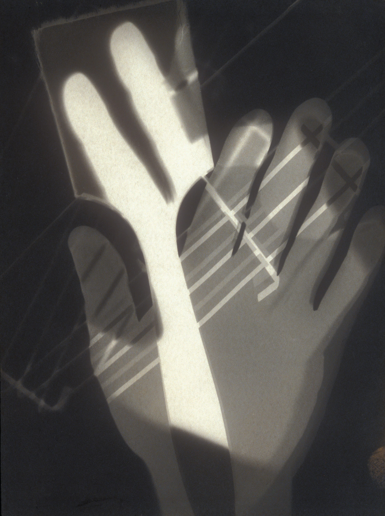
Although obviously both photograms, both photographers have taken a different approach to this camera-less art of photograms, as we can see from Man Ray's work on the left and Moholy Nagy's work on the right.

The aesthetics of each photograph from each artist are similar yet different. It's evident that both pictures were made using photographic paper and placing objects on top of the paper, then subjecting it to light. However even though the same technique was used, both photos are extremely different.

On the left (Man Ray's Rayogram) there's a bunch of jumbled letters possibly placed without any second thoughts, a cocked gun that seems to be missing a trigger and a barrel, and three other identifiable objects. There is shadowing between the lettering and the gun which could possibly indicate a few things: The objects on the photographic paper were moved throughout the whole process,The distance and aperture settings on the developer were changed throughout the process, diffusion of light or possibly two light sources instead of one, which created the shadowing effect. Although depending on the audience and how the individual interprets the photographers work, Man Ray's work was deliberately ambiguous and very random, having very little or no meaning to his photograms. Simply capturing a moment. 

Lazslo Moholy Nagy's work, on the other hand, had more meaning to it. Whereas Man Ray's work like the one above contained a high level of spontaneity, Nagy's work seemed more planned out which in turn created more depth and texture with the overlaying of the hand and paintbrush, the distance between the objects and brush in his photograms. In the photogram above he used a paint brush, a hand and what appears to be a grill top or a drying rack. Nagy created his work as a play on "art/ photography" making the theme of this work in particular about creativity. This made his work a bit more restricted as there was a set theme. There wasn't as much freedom in his work compared to Man Ray's rayogram. However Nagy's work is more abstract and childlike.


My Contact and Test Sheets


From making my test sheet I made the assumption that 2.5 seconds was the right timing for all of my negatives. However when producing my contact sheet and , later on, my photos I realised that this wasn't the case. Whereas on some of my photos on the contact sheet 2.5 seconds was the right exposure time, other photos required a lot more time on a  higher aperture setting, and others required a lot less time on a lower aperture setting. For example, One of my photos required 2.5 seconds with an F8 aperture, (no filter), whereas another photo from my negatives required F11 at 4.0 seconds.
Because of this I needed to make test strips of each individual photo I was going to use. I made sure that I documented which photos needed what time by using 1.0 second intervals to determine what images needed what settings. 
I believe that the reason each photo needed different setting was because, on each photo to create a different effect the shutter speed was changed, because of this each photo was exposed to a different amount of light, thats why the aperture had to change.

Friday, 28 September 2012

How to make a contact sheet ! =)


  1. In order to make a contact sheet you will need to cut your roll of film (negatives) and cut them into strips of six.
  2. The check your strips on a the light-box.
  3. Insert your strips of your negatives into the negative bag.
  4. Tricky Bit ! Making a test stip before making the actual contact sheet.
  • Set the aperture to F8 on the developer machine
  • Make sure there's no filter !
  • Place photographic paper onto the bed of the developer machine glossy side up
  • Place negatives onto the photographic paper also glossy side up
  • Place a pice of glass onto the the negatives so that way they're sandwiched together
  • Exposed negatives to one second intervals in using a sheet of back paper, so that the first picture on each set would have been exposed to six seconds and the last photo on each strip would have been exposed to only one seconds.
  • Once developed you shall be able to tell how much exposure would be suitable for the whole contact sheet.
  • in my case it is between 2 and 3 seconds
Once you have decided which time was best referring to your test sheet, repeat the process again without using black paper.


And now you have a contact sheet =)!!!!


Tuesday, 25 September 2012

Reversing your pinhole photographs !


How to Reverse your pinhole photographs !


Before doing anything you need to make sure the filter on the developing machine is over the light or you'll ruin your photographic paper !

  1. Take a piece of photographic paper and place it on the bed of the developing machine glossy side up over in the light. ( filter over the light)
  2. (The light switch is the button on the left)
  3. Take you chosen photograph and place it on top of the other piece of photographic paper face down so the picture is facing the glossy side of the other piece of paper.
  4. Then place the piece of glass on top of both pieces of paper so that they are sandwiched together.
  5. Turn the light off.
  6. Mo
  7. ve the filter to the left
  8. Press the big Grey button on the bottom right.
  9. After that the light should switch off automatically so when that is done all that needs to be done now is to develop the photos in the same process you did with the other photos =)
Once your photo is fully developed your reverse should look like a normal black and white picture instead of in negative like the one above. This is where you can experiment on Photoshop. This is my before picture.

In photoshop with this photo I went to image and changed the brightness and contrast and saved it.

I then changed the hue and saturation with this one and saved it.

I then went to photo filter and enhanced it and saved it.

I enhanced the vibrance with this one and saved it.

 And finally with this one I experimented with the hue and saturation again and got a Sepia effect.


Monday, 24 September 2012

Justin Quinnell


Justin Quinnell
*

Justin Quinnell, a contemporary artist/ photographer whose interesting and obscure photos borderline the edge of surrealism, looking at the distorted aspect, has mastered the art of pinhole photography.

Justin Quinnell's photography relates to everyday life 
taking photos from different points of view. With this being said his photography has no limits, and is very expressive, from taking photos from inside the mouth, below the feet and even leaving his pinhole camera to 3 months worth of exposure in light.
In some of his work you can see the use of vignetting(the reduction of brightness and saturation at the periphery), like the one above which makes his photography look as if he is spying on someone. His photography looks like as if it's an invasion of privacy, as with the one above with the foot creeping into the picture.


In most of his photography he muted the colours and underdeveloped/overdeveloped which gave the effect that you were squinting when looking at his work. However his photos look as if you're being engulfed in his photo. As if you're actually there when he was taking the photograph.
His unique photography can evoke different emotions with the different lighting and light exposures and positioning, for example the picture above would probably evoke a lonely, miserable, depressing, sympathetic emotion. Where as the one above could evoke a more secrecy, mysterious type of feel. He uses lighting and vignetting to evoke different emotions from the audience.

To be able to create such unique and creative work on such a small scale from such a small camera is simply genius.

Thursday, 20 September 2012

Justin Quinell Mood board

From top left to bottom Right.
  1. http://techbribe.com/wp-­‐ content/uploads/2009/09/img023invertedsmall.jpg
  2. http://techbribe.com/wp-­‐ content/uploads/2009/09/img019invertedsmall.jpg
  3. http://www.lomography.com/magazine/lifestyle/2011/04/19/justin-­‐ quinnell-­‐the-­‐pinhole-­‐wizard
  4. http://www.lomography.com/magazine/lifestyle/2011/04/19/justin-­‐ quinnell-­‐the-­‐pinhole-­‐wizard
  5. http://dev.arnolfini.org.uk/whatson/event.php?id=74
6. 

Wednesday, 19 September 2012

How to make a pinhole camera =).


How to make your very own pinhole camera!


Equipment needed...

  • Sandpaper
  • Metal Ruler
  • Whiteboard marker
  • Cloth tape
  • Scalpel 
  • Paintbrush
  • Black Acrylic Paint
  • Black paper.
  • A tin/Container/Shoe box that has a secure fitting lid.
  • Photographic paper (Black and White)
  • Needle
The first thing you'd need to do is to paint the inside of your chosen container and it's lid black using acrylic paint or lining it with black sugar paper in order to prevent any reflections inside the container.


Once the paint is dry and none of the original covering of the container can be seen, measure 5cm up from the base of your tin. Mark that point and draw a 1cm square around  that point. That point you drew around will make for your pinhole.


Then using your scalpel cut a square of thick aluminum foil and pierce your needle through it in a constant backwards and forwards twisting motion. Using the sand paper, sand down the back of the aluminum so that the hole is flat and then use the black marker to cover the back.

Now with all this done you can attach the foil to the 1cm square you cut into your container using the black cloth tape. Once fully secure create a 'lens cap' to cover the pinhole so that the photographic paper doesn't become exposed to light until necessary.

LIGHT TEST!

Now it's time to test the finished product. Take half a piece of photographic paper and place it so that the glossy side of the paper is facing the pinhole and secure the lid onto the container. Take it outside and remover the lens cap. After a few seconds replace the lens cap over the hole and take to he dark room. If the paper once developed comes out fully white the the container is light proof :D.


How a pinhole camera works =).

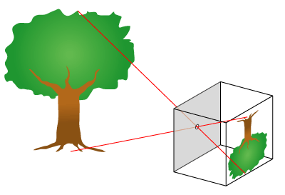
How does a pinhole camera work? It's quite simple actually. 
Light enters through the pinhole sized hole located in some thick aluminum, traveling in a straight line hits the photographic paper within the lightproof box. The image is inverted and is produced upside down on the photographic paper. Because the light is reflecting off the objects outside, the sections that come out black are those that have been exposed to light and the sections that remain white on the photographic paper haven't been exposed to the light.